
OpenRecovery: Onboarding People New to Recovery
OpenRecovery | Head of Content
At a glance: New users of a recovery app were mostly brand new to recovery and needed help quickly. I took over the app's onboarding email sequence and made the short how-to videos behind it, then reshaped the sequence around what signup, product and engagement data showed: get people to Kai, the app's AI recovery assistant, early, and keep the sequence short.
- My role:
- Head of Content
- Audience:
- New app users, most of them new to recovery
- Format:
- Automated email sequence (5 to 7 emails) and short how-to videos
The challenge
OpenRecovery's app offered several tools for people in addiction recovery. The most important was Kai, an AI chatbot trained on addiction recovery, with persistent memory and guardrails, built to push back and help users question their thought patterns and behaviors. Other features included Actions, for setting and tracking regular recovery actions, and later Communities, where users could join groups and meetings.
When someone downloaded the app and created an account, an automated email sequence introduced them to these features over their first few weeks. Our head of product had set up the original sequence. I took it over as Head of Content. I designed and produced short how-to videos for every email, wrote the email text with the head of product, and revised the order, timing and content of the sequence as we learned more about what kept people using the app.
01 Understanding the learners
We expected new users to arrive at many different points in recovery. Some would be new to the app but years into recovery, others somewhere in between. Signup questions, which were a key part of onboarding, showed that most of our new users were brand new to recovery itself, not only to the app or the 12 steps.
That changed how we thought about onboarding. People in their first days of recovery were often desperate. They wanted to do something about a problem that was killing them, but they weren't in a state to spend time learning how an app worked or working out the best way to use it. They needed the next step to be obvious, and they needed it right away.
We also learned which language pushed them away: spiritual or religious wording, dated 12-step terms like “character defects,” and anything that assumed prior knowledge. They wanted to talk about what was happening in their lives right now.
So onboarding became about getting people into a real conversation with Kai as quickly as possible, and later into Communities. Our thinking was that if someone got a valuable experience from Kai early, including some relief in a hard moment, and connected with people going through something similar, they had the best chance of getting a foothold in recovery and of staying with the app. Product data supported this. Users who engaged consistently with Kai stayed far longer than users of any other feature.
Design decision: Design for someone in their first days of recovery. Make the first step obvious, use plain language, and get them to Kai fast.
02 Designing the sequence
The first email arrived on the day someone signed up. It put Kai at the center and gave three clear next steps: track daily actions, add an accountability partner, and start working their program with Kai. The second email, sent soon after, covered Kai in depth. After that, emails came every few days and then weekly, and each one introduced a single feature, such as Actions.
Every email pointed to something to do in the app, with a short video showing exactly how to do it. The Kai email covered six ways to use Kai: chatting by text, by voice-to-text, or by voice call as if on the phone; step work; SMART Recovery and CBT exercises; inventories; and saved insights. Several of these had their own video.
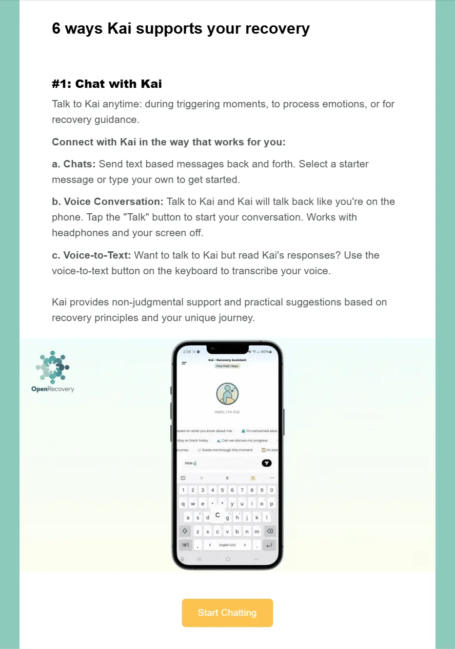
We wrote for people on any recovery pathway, whether 12 Steps, SMART Recovery or CBT, and kept the language plain.
Design decision: Put the most valuable feature first, then one feature per email and one task per video.
03 Making the videos
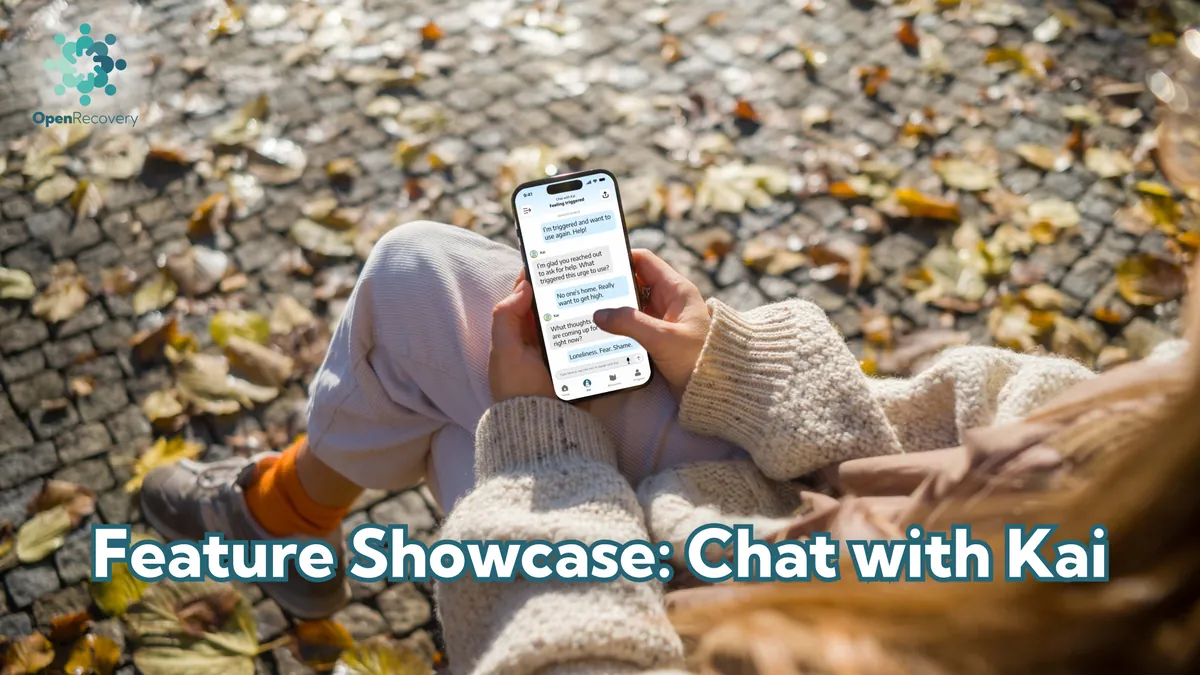
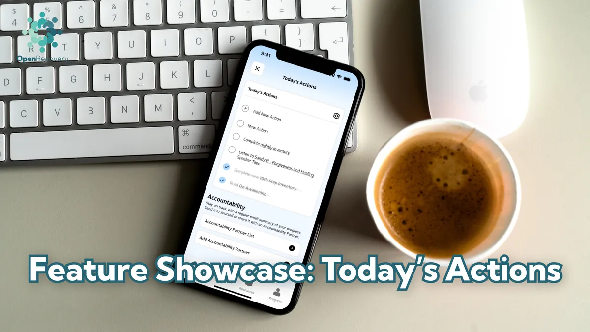
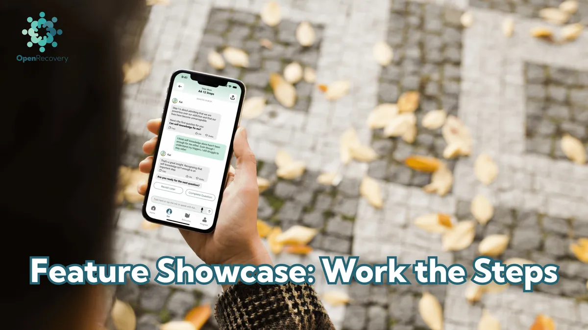
I made every video myself. I recorded the screen on my phone, wrote and recorded the voiceover, edited in Descript, and designed the thumbnails in Figma. Each video showed one thing a new user could do in the app, using demo data so no real user ever appeared. Most ran under a minute. The Kai videos ran three minutes or more, because Kai could be used in so many ways and people needed to see a real conversation unfold.
The videos lived in the app as well as in the emails, so people could find help with a feature at the moment they needed it. That meant each one had to make sense on its own, with no assumption that the viewer had seen the email or any other video. It also meant the title and thumbnail had to make it obvious what someone would get from watching, before they tapped.
Design decision: Make every video stand alone, and treat the title and thumbnail as part of the teaching.
Four of the videos, with the thumbnails I designed for them. Each opens on YouTube.

04 Iterating with data
The sequence went through many revisions while I ran it. We tracked who opened each email and who clicked through to the videos. Opens and clicks fell with each email, and by the sixth or seventh they were close to zero.
So we shortened the sequence and moved the most valuable content forward. If someone was only going to read two or three emails, those emails had to get them to Kai and show them what it could do.
Kai was the clearest example. Instead of adding more emails as Kai gained new uses, I kept one Kai email early in the sequence and made it more comprehensive. It grew from four ways to use Kai to six, adding SMART Recovery and CBT tools and voice conversation. It was longer than I'd normally want for someone in their first days of recovery, so it opened with the simplest option, just start chatting, and every other section led to one action and one short video. A fuller email that people actually opened seemed a better bet than extra emails they'd never reach.
Features further down the list went the other way. Progress, Content Styles and Resources each had their own email in the first full version. Later, they were dropped or combined into a single final email.
First full version
- WelcomeApp tour video, Kai, three next steps
- Get to know Kai4 ways to use Kai
- Build strong habitsToday's Actions, accountability partners
- Spot Checks
- Progress
- Content Styles
- Resources and Collections
Later version
- WelcomeKai at the center, three next steps
- KaiExpanded to 6 ways, including voice, SMART Recovery and CBT
- Actions
- CommunitiesAdded after launch
- Final roundupRemaining features in one email
Product priorities shaped the order too. When a feature turned out to be strongly linked to retention, as Kai was, or when the company was pushing a new feature, it moved up. New features were added to the sequence as they launched. When Communities launched, we announced it to all users in a one-off email, and most of that content later became part of the sequence.
When the company broadened beyond the 12 Steps, I rewrote the sequence to match, so it spoke to people working any recovery pathway.
Design decision: Keep revising the sequence, and save the early emails for what matters most.
05 What the data showed
Signup questions showed us who our new users were. Product data showed that users who engaged consistently with Kai stayed far longer than users of any other feature, and open and click data showed where people stopped engaging with the sequence. Each of these changed the design. Retention improved over the time I was there, but it moved with many changes across the app, and onboarding was only one of them. We never measured the sequence's effect on its own. What I can say is that it was built and rebuilt around what the data told us.
06 What I took forward
Design for the learner's state, as well as what they know. Many of our users were new to the app and going through the hardest days of their lives. That changed what good onboarding looked like: fewer choices, plainer language, and a valuable first experience as quickly as possible.
Spend early attention on what matters most. Attention was highest at the start and fell with every email. The first two emails carried the most weight, so that's where Kai went.
Let the data shape the plan. As engagement fell through the sequence, adding emails for each new feature would have buried them. The better move was to make the early emails richer and cut or combine the later ones.
Show exactly how. Each video showed one task, most in under a minute, so a new user could watch it and then do it straight away. Kai got longer videos because there was more to show.